
"Complacency" by Amy Chase, 9x5.5x5in, Porcelain Cone
It was recently announced that Amy Chase is one of the recipients of the 2017 Al Smith Fellowship. The prestigious award, named in honor of former arts council chair and Kentucky journalist Al Smith, recognizes professional artists who have reached a high level of achievement in their careers. Since its beginning in 1983, the program has provided more than $2.5 million in funding to artists in the visual arts, literary arts, media arts, composing and choreography. In this round of funding, the fellowships were awarded to artists in the choreography and literary arts disciplines.
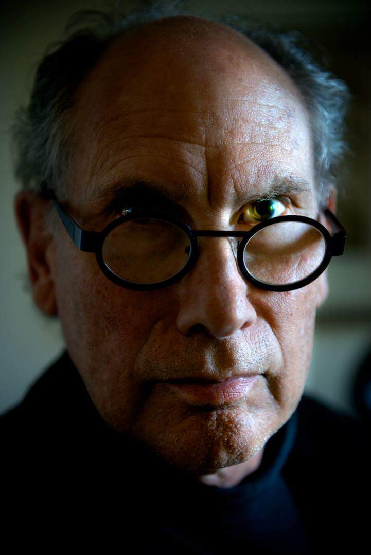
Examining a selection of Amy Chase’s work, one gets the sense that a community has been built. The forms are often abstract, but the relationships are clearly drawn, and some of the figures capture very human postures and attitudes. Those figures live on various platforms, so there is always a context of isolation or separation. Sometimes characters are drawn closer, and other times they are widening the distance between them. Often, and most irresistibly, two of them (for they almost always seem to come in pairs) are connected by a slender thread, pulling on their tether in a precarious fashion that creates a delicate tension.

"Compliance" by Amy Chase, 10x8x10in, Porcelain
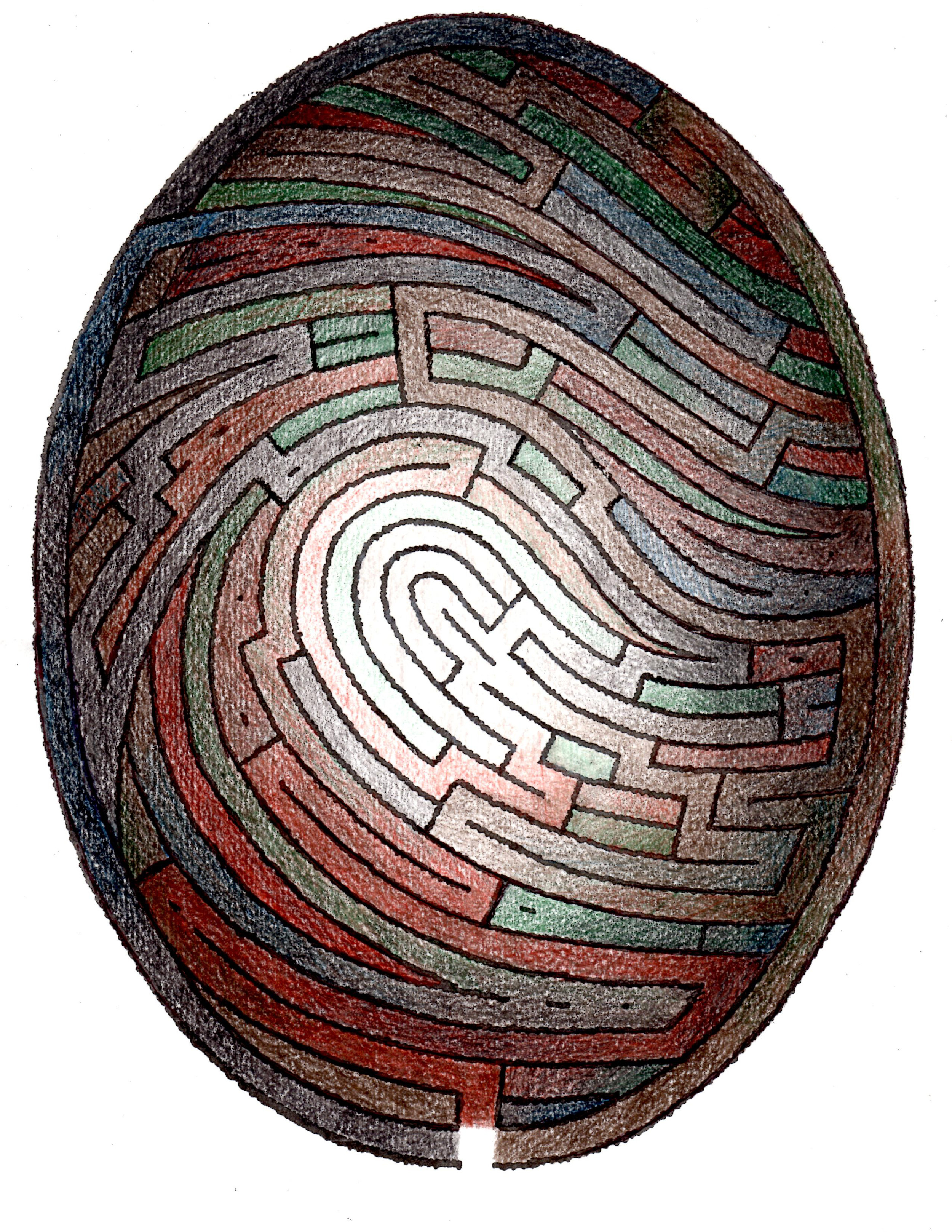
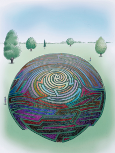
“The surface consists of intricate patterns that are applied using precise silkscreened slip and glazing techniques. These choices in pattern address personal experiences, while at the same time evoking the viewer’s own memories.”
Chase’s artist’s statement makes it explicit that these patterns and textures are drawn from childhood memory, so there is an undeniable element of autobiography in this work. Yet the abstraction puts us at a distance; we are empathetic because the fundamental dynamic at play resonates within our own memory. The anonymity allows us to see ourselves in this nebulous but welcoming community.

"Enticement" by Amy Chase, 3x4x3in, Porcelain, Underglaze, Luster
Chase is currently the Design Coordinator for Louisville Visual Art in Louisville, Kentucky. Since residing in Louisville she has also been the Ceramics Instructor and Gallery Director at Spot 5 Art Studio and taught Ceramics at Jefferson Community and Technical College. From 2010–2012 she was the Adjunct Professor of Ceramics at Southeast Missouri State University located in Cape Girardeau, Missouri.
Amy Chase has been awarded the title of ‘Emerging Artist’ by American Style magazine, has been featured in Ceramics Monthly, Clay Times, 500 Ceramic Sculptures and 500 Ceramic Vases. Chase has also has an extensive exhibition record including venues such as: The Clay Studio in Philadelphia, Pennsylvania; The Clay Studio of Missoula in Missoula, Montana; The Washington Project for the Arts in Washington D.C.; Carbondale Clay Center in Carbondale, Colorado and Lincoln Arts in Lincoln, California.
Hometown: Murray, Kentucky
Education: BFA, Murray State University; MFA, Southern Illinois University
Website: http://amychaseceramics.com

"Inclination" by Amy Chase, 8x4x3in, Earthenware, Fibers

"Solidarity" by Amy Chase, 9x7x4in, Porcelain, Stoneware, Flocking, String, Luster

"Deciphering Fiction" by Amy Chase, 6x6x6in, Terracotta, Wood, String, Underglaze
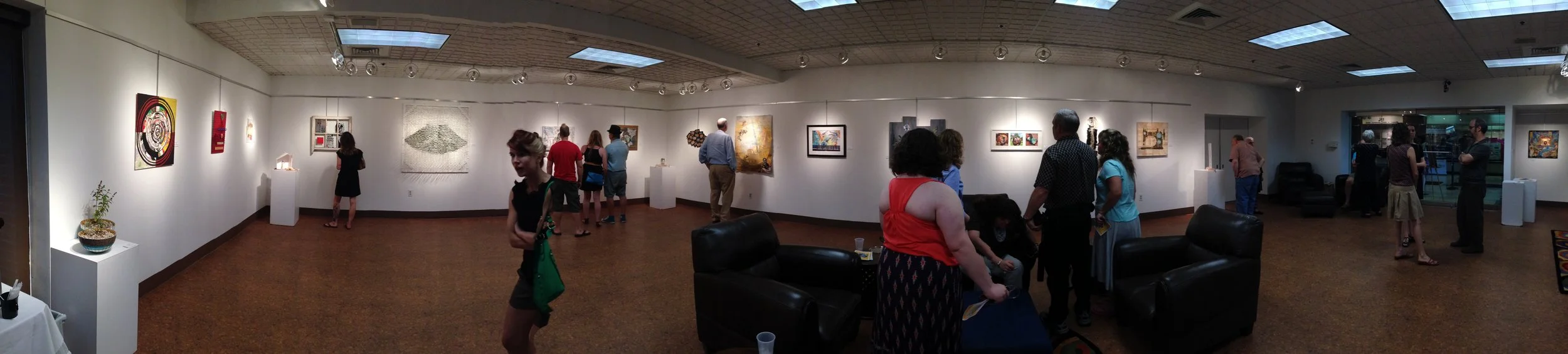
Written by Keith Waits. Entire contents copyright © 2017 Louisville Visual Art. All rights reserved.

Are you interested in being on Artebella? Click here to learn more.