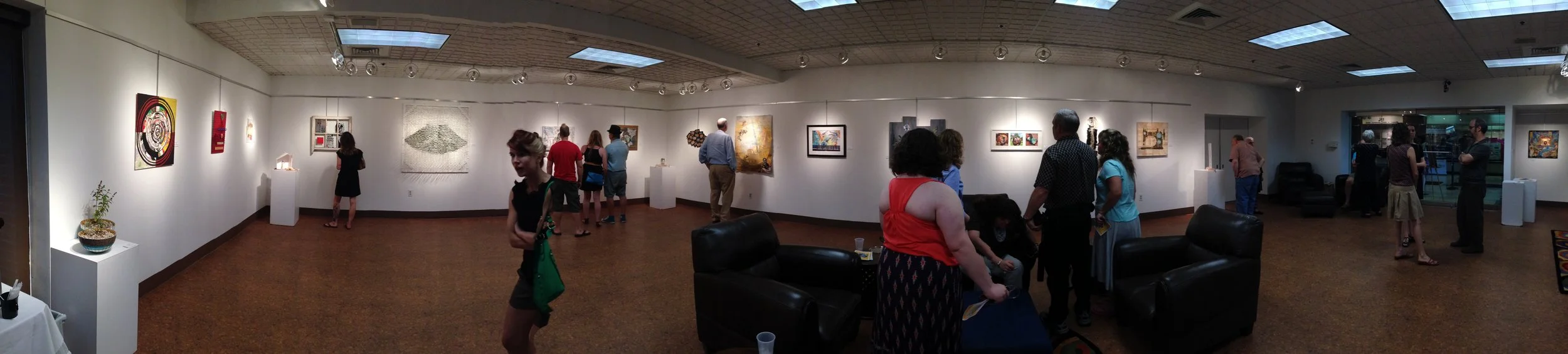
Panoramic shot of the Pairellels exhibit. (Photo courtesy of Kelly Rains.)
Complacency is the enemy of creativity. The very real and honest expression that authentic artists require of themselves demands challenge and occasionally it is important to upset the apple cart a little bit in order to rediscover the muse.

Curator & Artist, Stacey Reason
A 2013 exhibit at The Patio Gallery in the Jewish Community Center illustrated the idea in pointed fashion. As curated by Stacey Reason, the show, which was titled Pairallels, was described as a “collaborative exchange” in its prospectus materials, a sharing of work in the form of a hand-off from one artist to another, with virtually no restriction on what the second artist would bring to the effort. The prospectus used the word “subtract” to suggest what might be allowable for one artist to do with another artist’s unfinished work, and what resulted in some instances was a complete deconstruction of the original piece, as well as a sharp lesson in how two different generations of artists tend to define the word collaboration.
Artists who contributed to Pairallels were Brandon Bass, Andy Cozzens, Sarah Duncan, Mallorie Embry, Linda Erzinger, Meghan Greenwell, Brandon Harder, Phillip High, Mary Dennis Kannapell, Shohei Katayama, Keith Kleespies, Sally Labaugh, Kathy Loomis, Kacie Miller, Karisssa Moll, Jacque Parsley, CJ Pressma, Kelly Rains, Lelia Rechtin, Alli Wiles, Jenny Zeller and Suzi Zimmerer.
Ms. Reason is a founding member of The Louisville Artist’s Syndicate, an ad hoc group of young and primarily visual artists whose mission is to inspire and promote networking between what they felt was a disparate collection of painters, sculptors, filmmakers, musicians and writers, all working in the Louisville area but lacking the connectivity necessary to accomplish greater things. The group, active at the time, has become dormant in the years since.

Dead Machine, Jenny Zeller & Mallorie Embry, digital photography printed on mulberry paper dipped in encaustic wax, vellum, sewing patterns, thread, canvas, nails, paper, Price not available. (Photo courtesy of Kelly Rains.)
By contrast, an older generation of Louisville artists, many of them members of the informal “Artists’ Breakfast Group”, had for many years enjoyed a camaradarie and interconnectivity that might be a model of what the Syndicate hoped to foster among its core constituency: a flow of energy and understanding that makes it easier for creative individuals to support each other. The Patio Gallery’s director at the time, Bette Levy, had been a long-standing member of this group and invited Reason to mount her exhibit there.
In today’s creative culture, it is more difficult than ever to characterize any group of artists collectively as having a shared sensibility, but the more prominent members of the Syndicate were preoccupied with art that is of the moment: ephemeral, fluid, and at times limited in its concern for archival survival. Another exhibit that year at Spalding University’s Huff Gallery featured two Syndicate members, Andrew Cozzens and Brandon Harder, whose bold sculptural forms relied on the effect of the elements and the passage of time for their full impact. Some of the pieces, for all intensive purposes, existed only during the duration of the opening reception. A delicate assemblage of wires frozen in pieces of ice and suspended on string, for example, were allowed to slowly descend off of the string while they melted. What remained for the subsequent run of the exhibit were the underwhelming remnants of wire and string that lighted onto the gallery shelf beneath. What interests these artists is the specific process of change and deterioration, not a final, marketable, objet d' art. The approach is fascinating but it risks occupying the same place in the cultural memory as a good joke badly-retold: I guess you had to be there.

C.J. Pressma & Kelly Rains discuss the project in front of their piece. (Photo courtesy of Kelly Rains.)
Whereas the breakfast group, for the most part, makes art in a more traditional context, paintings, prints, and sculptures created, at least in part, with an eye on the marketplace. Most have been doing this for many years, and their body of work can often define them in very specific terms, a signature style that might be immediately recognizable when you enter a gallery. Jacque Parsley's assemblages and C.J. Pressma’s photographic quilts are but two examples of art that is sought after by collectors and marketed at premium prices, reflecting the quality of the work and the esteem in which these artists are held.
Both are valid perspectives, but once artists from both pools were drawn into the Pairallels project, perhaps it was inevitable that some level of disagreement would follow. "My idea was to let the art speak for itself," explains Reason. "It was supposed to be about the object, but it wound up being entirely about the artist." By design, there was no input between the individuals sharing the work, and apparently none of the artists saw the final results before the opening reception in June.

Grocery Store Mandala II, Kathy Loomis & Kelly Rains, grocery packaging, paper, chili peppers, found objects, fabric, wire, panel, paper, ink, acrylic, Price not available. (Photo courtesy of Kelly Rains.)
Among the breakfast group there were mixed reactions, including shock and outrage from a small number at what must have seemed a violation of their personal artistic integrity. In a few instances the piece from the first stage was physically deconstructed and enough parts discarded to render the source nearly unrecognizable. Elements were identifiable but the hand of the receiving artist might be said to have obliterated the original creative intent. Some tempers flared and some heads were scratched, mostly from within the breakfast group.
When, a few weeks later, there was an opportunity to sit down and talk it out, what was interesting was how much the conflict had turned into an opportunity for most of the participants. Creative types often like to indulge in a certain amount of denial that there is any gap between artists owing to generational differences, yet the reality of two distinct mind-sets about how visual artists approach their careers was obvious. During a meeting at one of the artist’s studios, the outrage was absent, replaced by an admission of recalcitrance from some, an expansion of perspective from others, and, arguably, enlightment all around. Some of the younger members spoke of the lack of attachment to the objects that they had fashioned and how they were sometimes excited to see the drastic alterations that had been employed once they passed off their work, while some in the breakfast group emphasized how they had chosen to dive into the project because, “...doing the same thing I had been doing”, wasn't good enough.

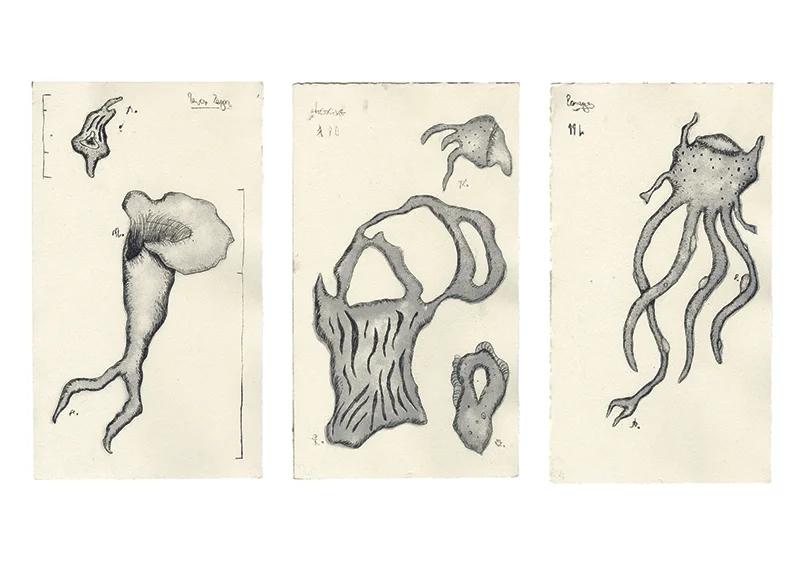
Synthesized Fang, Shohei Katayama & Alli Wiles, enamel, snake skin, beer cans, hot glue, wood, black primer, polyurethane, tracing paper, ink, Price not available. (Photo courtesy of Kelly Rains.)
Coming away from the experience, the lessons may be as varied as the individual sensibilities that populate both groups of artists. Breakfast members had come together out of an attraction to build a social context for like-minded artists who were rarely critical but always supportive of each other, while the Syndicate reinforced an aesthetic that embraces the notion that being knocked a little bit off your axis is sometimes a healthy thing.
Four years later, Reason reflects back on Pairallels: “The project was a great learning experience for everyone involved, myself included. I had no idea what kinds of outcomes to expect, and what happened was far more than what I could have anticipated. The dialog that was created surrounding the project was very productive - it gave a fresh look at individual studio practices, reminded us all of our potentials, and pushed everyone out of their comfort zone, which invariably made us all more comfortable in our individual practices. It was very rewarding to serve as the catalyst of this conversation that I think is still being carried out today in some form or another. If nothing else, it brought together two important groups/generations of artists in Louisville that hadn't intersected before.”
Pairallels was on display June 16 through July 16, 2013, in The Patio Gallery at the Jewish Community Center, Louisville, KY.
Stacey Reason is now the Director of the Yeiser Art Center in Paducah, Kentucky.

"Localized Cosmic Reactions (snapshots of the universe)" by Karissa Moll & Philip High. Price not available. (Photo courtesy of Kelly Rains.)

Time and Space, Sarah Duncan & Jacque Parsley, photography, fabric, lace, trim, found objects, clock, Price not available. (Photo courtesy of Kelly Rains.)
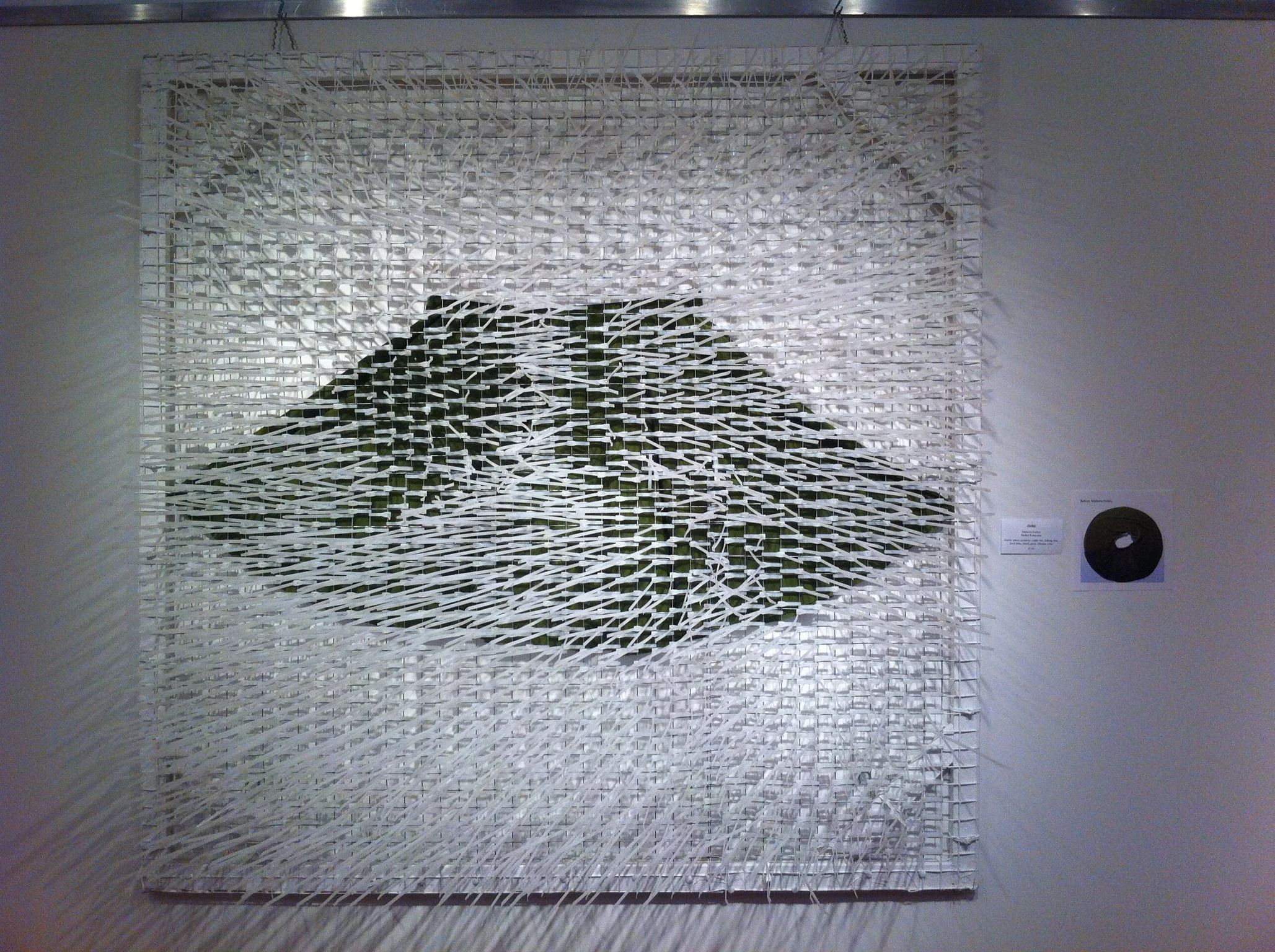
"Orbit" by Mallorie Embry & Shohei Katayama. Price not available. (Photo courtesy of Philip High)

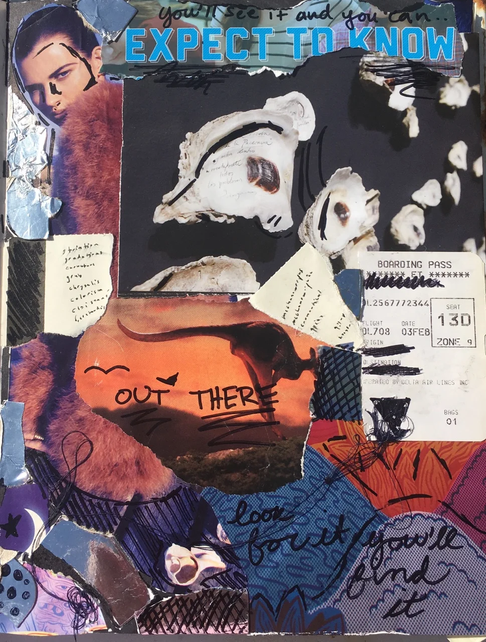
"Untitled", 12x20in, collage and gold paint on acrylic plastic. Price not available (Photo courtesy Kelly Rains)

This Feature article was written by Keith Waits.
In addition to his work at the LVA, Keith is also the Managing Editor of a website, www.Arts-Louisville.com, which covers local visual arts, theatre, and music in Louisville.
Entire contents are copyright © 2017 Keith Waits. All rights reserved. Used with permission.

Are you interested in being on Artebella? Click here to learn more.